 By Hamza
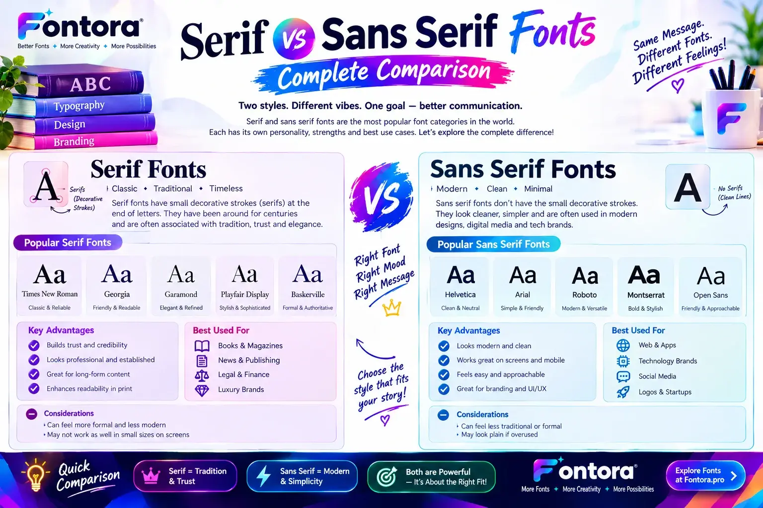
What is the difference between serif and sans serif fonts? Serif and sans serif fonts are two major typography styles. Serif fonts have small decorative strokes at the ends of letters, while sans serif fonts have clean, simple edges without these strokes. Serif styles often create a traditional and elegant feel, whereas sans serif fonts provide a modern and minimal appearance.
Serif vs Sans Serif Fonts: Complete Comparison
Introduction
Choosing the right font helps create clear, attractive, and effective designs. The difference between serif and sans serif fonts is an important part of typography because each typeface creates a unique visual style, improves readability, and influences how people experience content.
Serif fonts include small decorative strokes at the ends of letters and are commonly used in books, editorial designs, and professional branding. Sans serif fonts have clean and simple letterforms, making them popular for websites, mobile apps, digital products, and modern designs.
Understanding these font styles helps designers, marketers, and businesses choose better typography for their audience, brand identity, and design goals.
What Are Serif Fonts?
Serif fonts are typefaces that contain small decorative strokes attached to the ends of letters. These additional strokes are called serifs, and they give letters a more traditional and structured appearance. Serif typefaces have been used for centuries in printed materials because of their classic style, readability, and professional look.
The small details in serif letterforms create a sense of balance and visual rhythm. This makes them a popular choice for long-form reading materials such as books, newspapers, magazines, and academic publications.
In typography, serif fonts are often associated with qualities such as:
Tradition
Trust
Authority
Elegance
Professionalism
For example, many luxury brands, publishing companies, and established organizations use serif typography to communicate experience and reliability.
Characteristics of Serif Fonts
Serif fonts have several recognisable features that make them different from other typefaces.
Decorative Letter Endings
The most noticeable feature of serif fonts is the small strokes or extensions at the end of each character. These details create a distinctive appearance and help separate individual letters.
For example:
Serif style: Times New Roman, Georgia, Garamond
The letter shapes often feel more detailed and expressive compared with simple modern fonts.
Classic and Professional Appearance
Serif fonts are commonly used when a design needs to communicate credibility and sophistication. They are frequently found in:
Books
Newspapers
Editorial websites
Academic documents
Luxury branding
Financial services
A company using serif typography may want customers to associate its identity with experience, stability, and trust.
Strong Connection With Print Design
Historically, serif fonts became popular because they worked well in printed materials. The additional strokes helped create a comfortable reading flow, especially in large blocks of text.
Today, serif fonts are still widely used in both print and digital environments, especially when designers want a classic or premium visual style.
Popular Examples of Serif Fonts
Some well-known serif typefaces include:
Times New Roman
One of the most recognised serif fonts worldwide. It is commonly used in newspapers, academic writing, and formal documents.
Georgia
Designed for digital readability, Georgia provides a classic appearance while remaining comfortable on computer screens.
Garamond
A traditional serif typeface known for its elegant and artistic style.
Playfair Display
A modern serif font often used in fashion, luxury branding, and creative designs.
You can explore more font categories and styles in our complete guide to different types of font styles.
What Are Sans Serif Fonts?
Sans serif fonts are typefaces that do not contain decorative strokes at the ends of letters. The word “sans” means “without,” so sans serif literally means “without serifs.”
These fonts focus on clean shapes, simple structures, and modern visual communication. Because of their clarity and minimal design, sans serif fonts are widely used in digital products, websites, mobile applications, and technology brands.
Sans serif typography is often connected with:
Simplicity
Innovation
Modern design
Accessibility
Clean communication
Many digital companies prefer sans serif fonts because they provide a smooth reading experience across different screen sizes.
Characteristics of Sans Serif Fonts
Clean and Simple Letterforms
Sans serif fonts remove decorative elements and create straightforward letter shapes. This simplicity helps content appear organized and easy to understand.
Examples include:
Arial
Helvetica
Inter
Montserrat
These fonts are frequently used in interfaces where clarity and quick understanding are important.
Popular in Digital Design
Modern digital experiences rely heavily on sans serif typography because websites, apps, and software products require fonts that remain readable on different devices.
Common uses include:
Website interfaces
Mobile applications
Software dashboards
Social media graphics
Digital advertisements
For creators who want to experiment with different digital typography styles, Fontora’s font generator tools provide different font options for creative projects.
Modern Brand Communication
Many technology companies and startups use sans serif fonts because they represent innovation, simplicity, and forward-thinking design.
A clean sans serif typeface can help a brand appear:
Friendly
Modern
Accessible
Professional
Serif vs Sans Serif Fonts: Key Differences
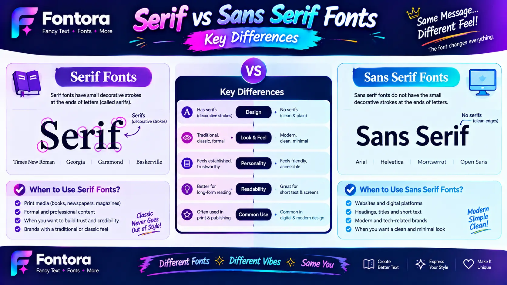
Understanding the difference between serif and sans serif fonts helps designers make better choices for websites, branding, publications, and digital products. Although both belong to the same typography family, their visual structure, personality, and practical applications are different.
The main difference is simple: serif fonts contain decorative strokes on letters, while sans serif fonts use clean letterforms without those additional details. However, font selection involves more than appearance. Designers also consider readability, audience expectations, brand identity, and the environment where the text will appear.
Letter Structure and Design Style
The biggest visual difference between these two font categories is the structure of their characters.
Serif fonts include small extensions at the ends of letters. These details create a more traditional and refined appearance. For example, the small lines attached to the top or bottom of letters in Times New Roman are serif elements.
Sans serif fonts remove these extra strokes and create simpler shapes. Their clean structure gives them a modern and minimal appearance, which is why they are commonly used in digital interfaces.
For example:
Serif style:
Times New Roman
Georgia
Garamond
Sans serif style:
Arial
Helvetica
Inter
Both styles can communicate professionalism, but they create different emotional impressions.
Visual Personality and Brand Message
Typography is not only about making words readable. Fonts also communicate personality and influence how people perceive a brand.
Serif fonts often create a feeling of:
Tradition
Experience
Trust
Elegance
Authority
This is why many luxury brands, publishing companies, and professional organizations choose serif typography.
For example, a premium fashion brand may use a serif typeface to create a sophisticated and timeless image.
Sans serif fonts usually communicate:
Modernity
Simplicity
Innovation
Friendliness
Accessibility
Technology companies, startups, and digital platforms frequently choose sans serif fonts because they match modern user expectations.
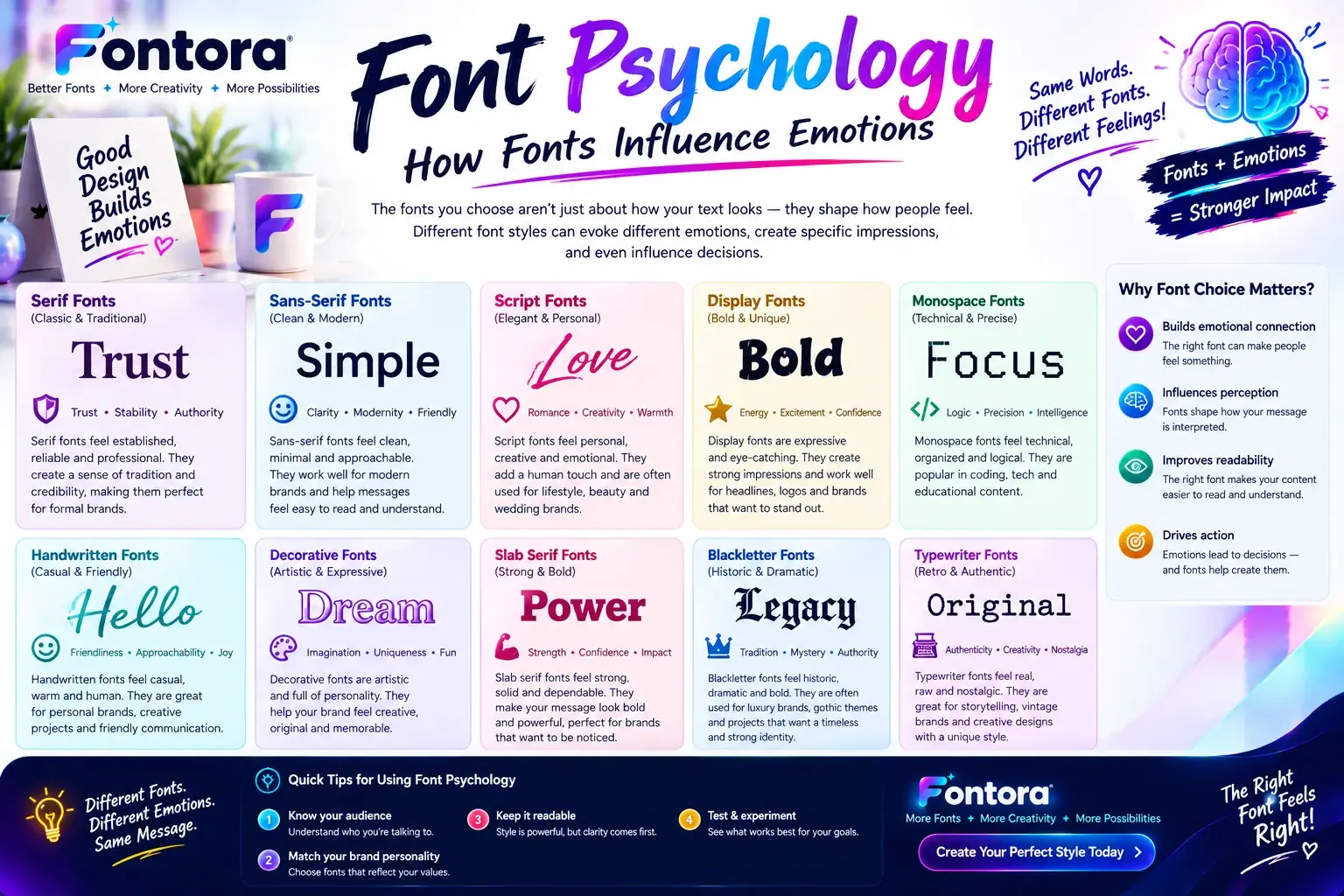
Understanding how fonts influence emotions is an important part of design. You can learn more about this topic in our guide on font psychology.
Readability Differences Between Serif and Sans Serif Fonts
Readability is one of the most discussed topics when comparing serif and sans serif fonts. The truth is that readability depends on several factors, including:
Font size
Line spacing
Screen quality
Contrast
Content length
Audience
There is no single font style that works best for every situation.
Serif Fonts for Long-Form Reading
Serif fonts have traditionally been used for long-form printed content such as:
Books
Newspapers
Magazines
Academic publications
The additional letter details can help create a visual flow when reading large amounts of text.
For example, printed novels often use serif fonts because readers are comfortable with their classic appearance.
Sans Serif Fonts for Digital Reading
Sans serif fonts are extremely common online because they work well on screens.
They are frequently used for:
Websites
Mobile applications
Software platforms
Social media content
Digital advertisements
Their simple shapes can remain clear even at smaller sizes, making them useful for responsive web design.
Serif vs Sans Serif Fonts in Web Design
Modern websites require typography that works across different devices, including:
Desktop computers
Tablets
Smartphones
Web designers often choose sans serif fonts for body text because they provide a clean digital reading experience.
However, serif fonts are also popular in web design, especially for:
Blog headlines
Editorial websites
Luxury websites
Creative portfolios
Many professional websites combine both styles to create contrast.
For example:
Serif font for headings
Sans serif font for body text
This combination creates visual hierarchy and improves content organisation.
Popular Serif Font Examples
Serif fonts come in many different styles, from traditional to modern designs.
Times New Roman
Times New Roman is one of the most recognisable serif fonts. It has been widely used in newspapers, formal documents, and academic writing.
Its characteristics include:
Classic appearance
Professional style
Balanced letter spacing
Georgia
Georgia was designed with screen readability in mind. It maintains a traditional serif appearance while working well on digital displays.
Common uses:
Websites
Blogs
Online publications
Garamond
Garamond is known for its elegant and artistic appearance. It is often used in books, magazines, and premium designs.
Playfair Display
Playfair Display is a modern serif font frequently used in:
Fashion websites
Creative projects
Luxury branding
It combines traditional serif elements with a contemporary style.
Popular Sans Serif Font Examples
Sans serif fonts are available in many modern styles.
Arial
Arial is one of the most widely used sans serif fonts. It is simple, clear, and suitable for many digital applications.
Helvetica
Helvetica is a famous minimalist typeface used by many designers worldwide.
It is known for:
Clean appearance
Balanced proportions
Professional design
Inter
Inter is a modern font created specifically for digital interfaces.
Common uses:
Websites
Apps
Software products
Montserrat
Montserrat is a popular geometric sans serif font used for:
Branding
Headlines
Marketing designs
How Serif and Sans Serif Fonts Work Together
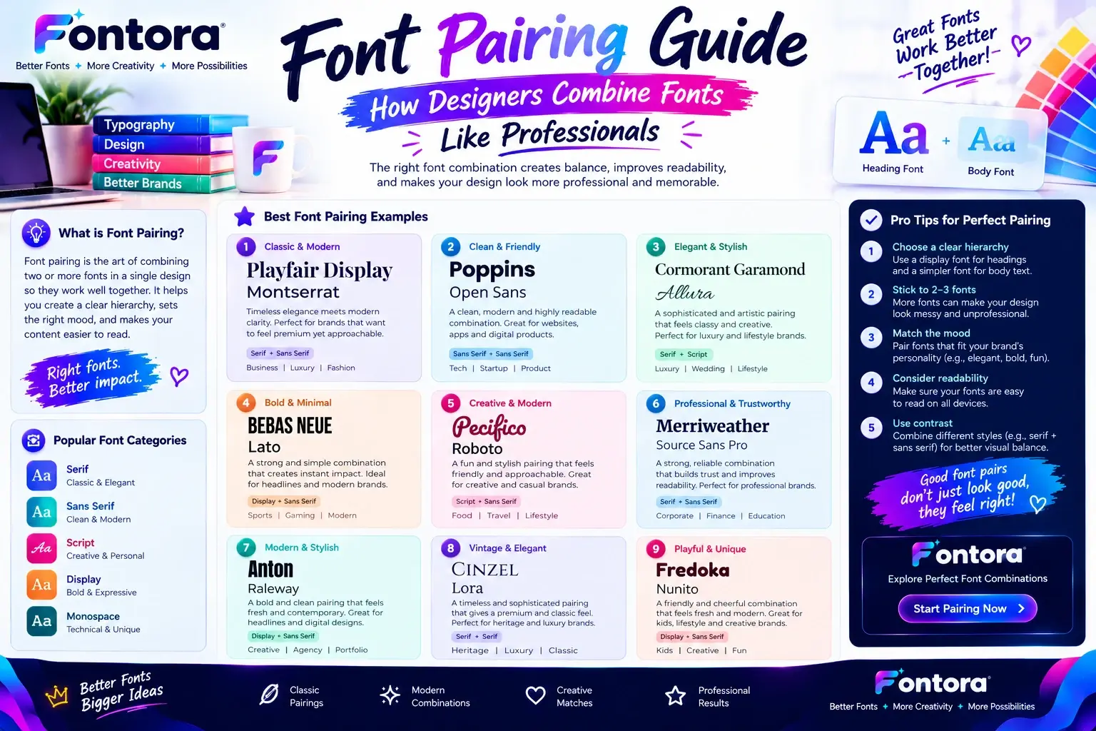
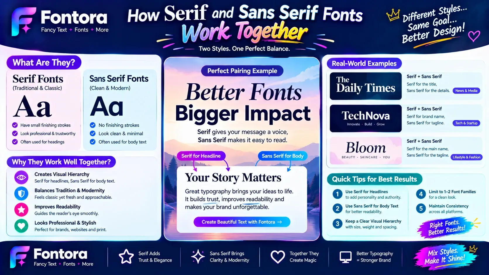
Designers do not always need to choose only one font category. Combining serif and sans serif fonts can create a balanced and attractive design.
This technique is called font pairing.
A common approach is:
Serif heading + sans serif body text
Sans serif heading + serif body text
For example:
A website may use a bold serif heading to create personality while using a clean sans serif font for paragraphs to improve readability.
Good font combinations create:
Better visual hierarchy
More engaging layouts
Stronger brand identity
Learn more about creating balanced typography combinations in our Font Pairing Guide.
When Should You Use Serif Fonts?
Choosing a serif font depends on the message, audience, and purpose of your design. Serif typefaces are often selected when a brand or project needs to communicate experience, trust, tradition, and a premium feeling.
Because serif fonts have a classic visual style, they work especially well in situations where credibility and elegance are important.
Serif Fonts for Professional and Traditional Brands
Many industries use serif typography because it creates a sense of authority and reliability.
Common examples include:
Law firms
Financial organisations
Publishing companies
Educational institutions
Luxury brands
Historical organisations
A serif typeface can help these brands appear established and trustworthy.
For example, a luxury fashion company may choose an elegant serif font for its logo because the style creates a connection with craftsmanship and heritage.
Serif Fonts in Editorial and Print Design
Serif fonts have a strong connection with printed content. They are commonly used in:
Books
Newspapers
Magazines
Research papers
Editorial websites
Long-form content often benefits from serif typography because the letter details create a comfortable reading rhythm.
For example, many book publishers use serif fonts because they provide a traditional reading experience that audiences recognise.
Serif Fonts for Premium and Elegant Designs
If a design needs a sophisticated appearance, serif fonts can add a sense of luxury.
They are commonly used for:
Wedding invitations
Fashion branding
Beauty products
High-end websites
Creative portfolios
A carefully selected serif font can make a design feel more exclusive and refined.
When Should You Use Sans Serif Fonts?
Sans serif fonts are a strong choice when the goal is to create a clean, modern, and accessible design.
Their simple structure makes them suitable for digital platforms where users need to understand information quickly.
Sans Serif Fonts for Websites and Apps
Most modern digital products use sans serif typography because it performs well across different screen sizes.
Common applications include:
Websites
Mobile apps
Software dashboards
Online platforms
Digital tools
The clean letter shapes help users scan content easily and navigate interfaces comfortably.
Sans Serif Fonts for Technology Brands
Technology companies often choose sans serif fonts because they represent:
Innovation
Simplicity
Efficiency
Modern thinking
Many software companies and startups use minimalist sans serif typography to create a professional digital identity.
Sans Serif Fonts for Social Media and Marketing
Social media graphics, advertisements, and online campaigns often use sans serif fonts because they are easy to read quickly.
Examples include:
Instagram posts
YouTube thumbnails
Digital advertisements
Website banners
For creators who want unique text designs for online platforms, a Fancy Text Generator can help create different text styles for social media and creative projects.
Serif vs Sans Serif Fonts in Branding
Typography is a major part of brand identity. The font a company chooses can influence how customers understand its personality.
A brand font should match:
Target audience
Industry
Brand values
Communication style
Customer expectations
Serif Branding Personality
Brands using serif fonts often want to communicate:
Trust
Heritage
Quality
Experience
Luxury
Examples of industries where serif branding is common:
Luxury fashion
Finance
Publishing
Professional services
A serif typeface can make a brand feel more established and timeless.
Sans Serif Branding Personality
Brands using sans serif fonts often focus on:
Innovation
Simplicity
Accessibility
Modern lifestyle
Common industries include:
Technology
Software
Digital services
Startups
A clean sans serif logo can create a friendly and approachable identity.
Can Serif and Sans Serif Fonts Be Used Together?
Yes. Combining serif and sans serif fonts is one of the most common techniques in modern typography.
Designers often use different font categories together to create contrast and improve readability.
For example:
Combination 1:
Serif heading + Sans serif paragraph
This creates:
Elegant headlines
Clean body text
Better visual balance
Combination 2:
Sans serif heading + Serif article content
This creates:
Modern structure
Traditional reading experience
The key is maintaining balance. Fonts should complement each other rather than compete for attention.
How To Choose Between Serif and Sans Serif Fonts
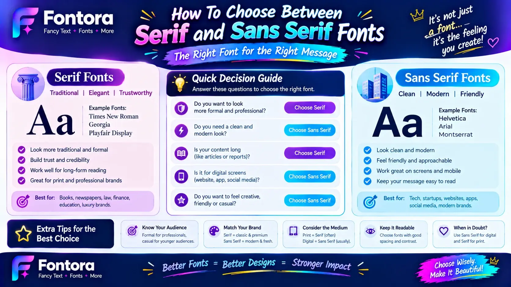
Selecting the right font style depends on your project goals.
Consider these factors:
1. Understand Your Audience
Think about who will interact with your content.
Examples:
A financial website may benefit from a trustworthy serif style.
A technology application may need a clean sans serif appearance.
2. Consider Your Platform
Different platforms have different requirements.
Print:
Serif fonts are often suitable for:
Books
Magazines
Brochures
Digital:
Sans serif fonts are commonly used for:
Websites
Apps
Software interfaces
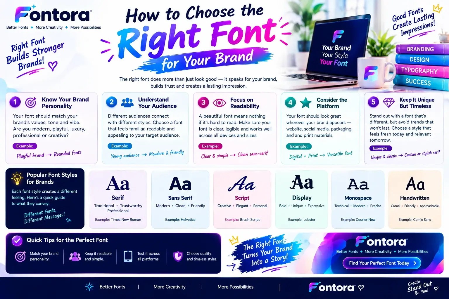
3. Match Your Brand Personality
Ask:
Do you want your brand to feel traditional?
Do you want it to appear modern?
Should it feel premium or simple?
Your font choice should support your overall message.
You can learn more about selecting suitable typography for business identity in our guide on choosing the right brand fonts.
Typography, User Experience, and Design Quality
Good typography improves more than appearance. It affects how users interact with information.
Effective font selection helps improve:
Reading comfort
Content structure
Brand recognition
User engagement
Typography works together with layout, spacing, colors, and visual hierarchy to create a complete design experience.
For a deeper understanding of how typography affects design decisions, explore our Typography Guide.
How Fontora Helps You Explore Different Font Styles
Finding the right typography style becomes easier when you can test different options.
Fontora allows creators to explore different font styles, experiment with text designs, and discover suitable typography choices for personal and professional projects.
Whether you need creative text styles, branding inspiration, or design ideas, experimenting with different typefaces helps you understand what works best for your audience.
You can also explore different typography options using a Font Generator to create unique text variations.
Common Mistakes When Choosing Between Serif and Sans Serif Fonts
Choosing a font is not only about selecting a design that looks attractive. A typeface should support the purpose of your content, improve readability, and match your brand identity. Many businesses and designers make font selection mistakes because they focus only on appearance instead of considering audience, platform, and user experience.
Avoiding these common mistakes can help create more professional and effective designs.
Using Fonts Without Considering the Audience
One of the biggest mistakes is selecting a font without understanding who will read the content.
Different audiences respond differently to typography.
For example:
A luxury brand may require an elegant serif typeface.
A technology company may need a clean sans serif style.
A children’s brand may use playful and creative fonts.
The font should match the expectations and preferences of the target audience.
Choosing Style Over Readability
A beautiful font is not always a practical font.
Some decorative typefaces may look impressive but become difficult to read when used for large amounts of text.
Good typography balances:
Visual appeal
Clarity
Reading comfort
Functionality
For example, a creative display font may work well for a logo or headline but may not be suitable for a long article.
Using Too Many Fonts in One Design
Another common mistake is combining too many different typefaces.
Using many fonts can make a design feel:
Confusing
Unorganized
Less professional
Most successful designs use a limited number of fonts with clear roles.
A simple approach:
One font for headings
One font for body content
Optional accent font for special elements
This creates consistency and improves visual hierarchy.
Serif vs Sans Serif Fonts for Different Industries
Different industries often use typography styles that match their communication goals.
Technology and Software Industry
Technology companies usually prefer sans serif fonts because they communicate:
Innovation
Simplicity
Speed
Modern solutions
Common uses:
Software websites
Mobile applications
SaaS platforms
Digital products
Clean sans serif typography helps users quickly understand digital interfaces.
Fashion and Luxury Industry
Luxury brands often use serif fonts because they create:
Elegance
Premium feeling
Tradition
Exclusivity
Serif typography can help communicate craftsmanship and long-term brand value.
Publishing and Media Industry
Publishing companies frequently use serif fonts because of their connection with:
Books
Articles
Editorial content
Professional writing
The traditional appearance supports a sense of authority and credibility.
Creative and Design Industry
Creative professionals often experiment with both serif and sans serif fonts.
Designers may combine:
Serif headlines
Sans serif descriptions
to create a balanced and visually interesting composition.
For designers exploring different combinations, understanding font pairing techniques can help create stronger visual relationships between typefaces.
Are Serif Fonts Better Than Sans Serif Fonts?
Neither serif nor sans serif fonts is universally better. The best choice depends on the purpose, environment, and audience.
Serif fonts may work better when you need:
Traditional appearance
Editorial style
Professional communication
Premium branding
Sans serif fonts may work better when you need:
Modern design
Digital readability
Simple communication
Clean interfaces
The right font is the one that supports the message you want to communicate.
How Font Styles Influence User Perception
Fonts communicate information beyond words. Before users read the message, they often notice the visual personality of the typography.
A font can influence whether a design feels:
Professional
Friendly
Creative
Modern
Reliable
This connection between typography and human perception is known as font psychology.
For more insights, explore our guide on how fonts influence emotions.
The Future of Serif and Sans Serif Fonts
Typography continues to evolve with changes in technology and digital communication.
Modern designers are not limited to choosing one style. Many contemporary designs combine traditional and modern elements to create unique experiences.
Current trends include:
Custom brand typefaces
Variable fonts
Responsive typography
AI-assisted font creation
Personalised digital experiences
As websites, applications, and brands continue to grow, choosing the right typography will remain an important part of effective communication.
Conclusion
The choice between serif and sans serif fonts depends on your design goals, audience, and communication needs. Serif fonts provide a classic and elegant appearance, while sans serif fonts offer a clean and modern style. Both typography styles have valuable uses in branding, websites, publishing, and digital products.
By understanding their differences and applying the right font principles, designers and businesses can create clearer, more attractive, and memorable experiences. For more typography resources, explore Fontora’s guides on font styles and creative font solutions.
Frequently Asked Questions About Serif vs Sans Serif Fonts
What is the difference between serif and sans serif fonts?
Serif and sans serif fonts are two major categories of typefaces used in typography. Serif fonts contain small decorative strokes at the ends of letters, while sans serif fonts have clean letterforms without these extra details. Serif styles often create a classic and professional appearance, whereas sans serif fonts provide a modern and minimal design style.
Are serif fonts better than sans serif fonts?
Neither serif nor sans serif fonts is always better because the right choice depends on the purpose, audience, and platform. Serif fonts are often suitable for editorial designs, books, and traditional branding, while sans serif fonts are commonly used for websites, applications, and modern digital products where simplicity and clarity are important.
Which font style is better for websites?
Sans serif fonts are commonly used for websites because their clean shapes are easy to read across different screen sizes. However, serif fonts can also work effectively for website headings, editorial layouts, and premium brand designs. Many professional websites combine both styles to create strong visual hierarchy and better user experience.
Can serif and sans serif fonts be used together?
Yes, serif and sans serif fonts can be combined to create balanced and attractive designs. Designers often use a serif font for headlines and a sans serif font for body text to create contrast, improve readability, and establish a clear content structure. This technique is known as font pairing.
Are serif fonts outdated?
No, serif fonts are not outdated. Although sans serif fonts are popular in modern digital design, serif typefaces remain widely used in publishing, luxury branding, editorial websites, and professional industries. Their traditional appearance helps brands communicate trust, elegance, and authority.
Why do brands choose sans serif fonts?
Brands choose sans serif fonts because they create a clean, modern, and accessible visual identity. Technology companies, startups, and digital platforms often use sans serif typography because it supports simple communication and works well across websites, mobile applications, and software interfaces.
Do serif fonts improve readability?
Serif fonts can support comfortable reading, especially in printed materials such as books and magazines. However, readability depends on several factors, including font size, spacing, contrast, screen quality, and content structure. A well-designed serif or sans serif font can provide a positive reading experience when used correctly.
What are examples of serif and sans serif fonts?
Popular serif fonts include Times New Roman, Georgia, Garamond, and Playfair Display. Popular sans serif fonts include Arial, Helvetica, Inter, and Montserrat. Each font has a different personality and purpose, so designers select them based on the project requirements, audience, and brand message.
How do I choose the right font for my brand?
Choose a font by considering your brand personality, target audience, industry, and communication goals. Serif fonts may suit brands that want to appear traditional and premium, while sans serif fonts often work well for modern and digital-focused businesses. A good typography choice should support your brand identity and user experience.
Where can I learn more about typography and font selection?
You can explore Fontora’s typography resources to understand font styles, type selection, and creative design techniques. Learning about font styles, typography basics, and font psychology can help designers make better font decisions.