 By Hamza
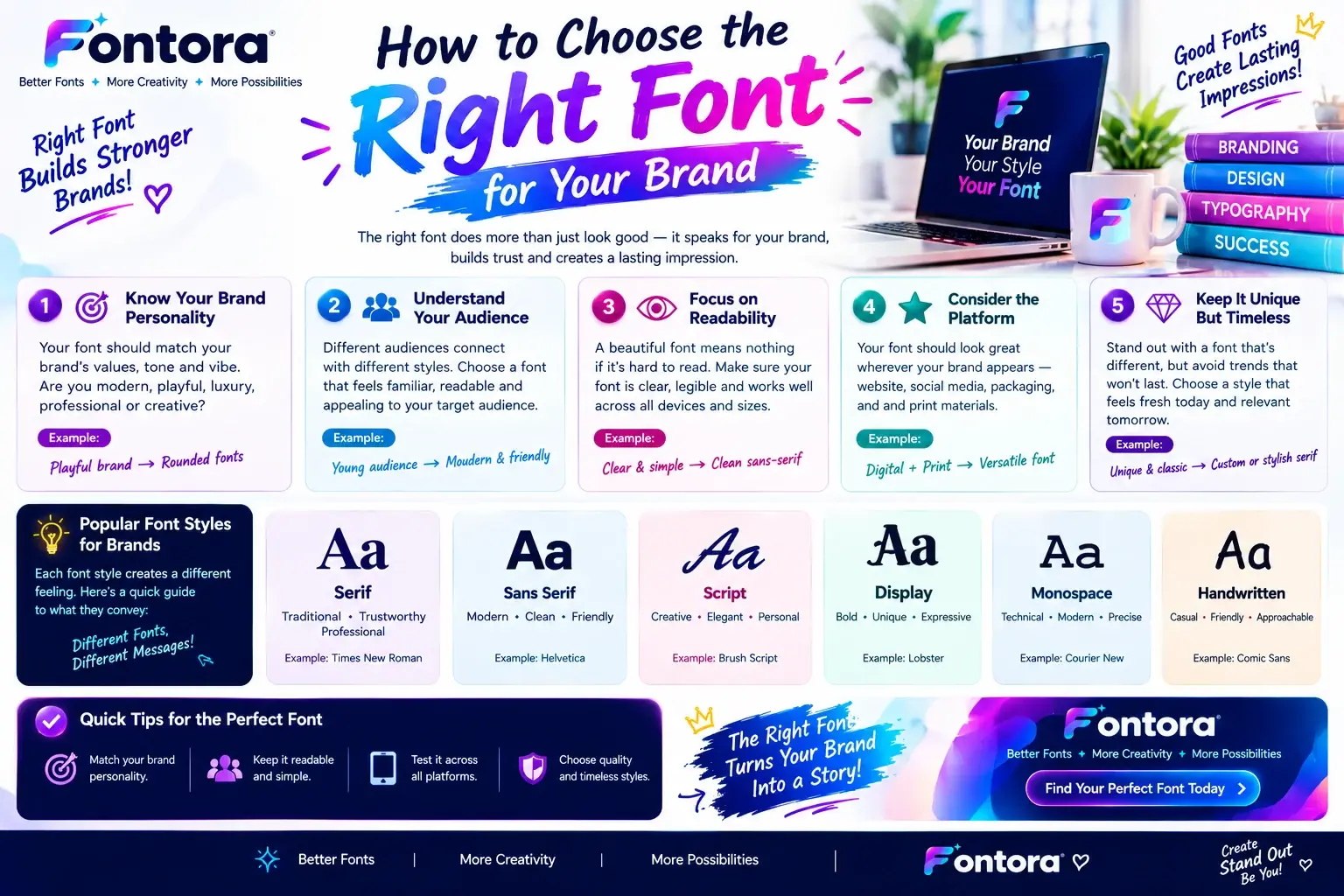
Quick Answer: How Do You Choose The Right Font For Your Brand? Choosing the right font for your brand starts with understanding your brand personality, target audience, and the message you want to communicate. A good brand font should reflect your business identity, remain easy to read across different platforms, and create consistency between your logo, website, social media, and marketing materials. The right typography helps build recognition and a stronger connection with your audience.
Introduction
Choosing the right font for your brand is a powerful way to create a memorable, recognisable, and professional brand identity. A carefully selected brand font helps your business communicate its personality, build audience trust, and create a consistent visual experience across your logo, website, social media, packaging, and marketing materials.
The perfect typeface does more than improve appearance; it strengthens your brand message, improves customer connection, and helps your business stand out in a competitive market. A modern font can represent innovation, a classic serif font can communicate elegance and authority, while a creative display font can express originality and personality.
Great brands use typography strategically by matching their font choices with their audience, industry, values, and visual goals. The right typography creates clarity, improves recognition, and supports a stronger brand presence across every platform.
When your font style matches your brand identity, it creates a lasting impression and helps customers remember your business. In this guide, you will discover how to choose the right font for your brand, understand font psychology, explore popular typography styles, avoid common selection mistakes, and build a professional typography system that supports long-term growth.
Why Choosing The Right Font For Your Brand Matters
A brand font is not just a design element; it is a visual representation of how a business communicates with its audience. Before customers understand your products or services, they often notice your visual identity first, and typography plays a major role in shaping that first impression.
The right font can communicate important qualities about a brand, such as trust, creativity, professionalism, innovation, or luxury. A financial company may need typography that feels reliable and established, while a creative brand may prefer a more expressive and unique style.
Strong brands use typography consistently across different platforms, including websites, logos, packaging, advertisements, presentations, and social media content. This consistency helps create recognition and makes the brand experience feel more professional.
For example, companies like Apple use clean and minimal typography to support their modern identity, while luxury fashion brands often choose elegant typefaces that reflect exclusivity and craftsmanship.
Choosing the right brand fonts requires understanding more than just visual appearance. A font should match the brand personality, connect with the target audience, remain readable, and work effectively across different digital and physical environments.
A carefully selected font becomes part of the brand story. It helps customers instantly understand what a business represents and creates a stronger connection between the company and its audience.
Understand Your Brand Personality Before Choosing A Font
Before selecting a font, the first step is understanding the personality and message behind your brand. Every business has its own voice, and typography should support that identity rather than compete with it.
A useful way to choose typography is to define your brand using simple personality traits.
Ask questions like:
Is your brand modern or traditional?
Is it professional or playful?
Is it luxurious or affordable?
Is it bold or minimal?
Is it serious or friendly?
The answers help narrow down the types of fonts that match your visual direction.
For example, a luxury brand may need a refined and elegant appearance, while a children's brand may benefit from friendly and creative typography. A technology startup may prefer clean and simple lettering that communicates innovation and efficiency.
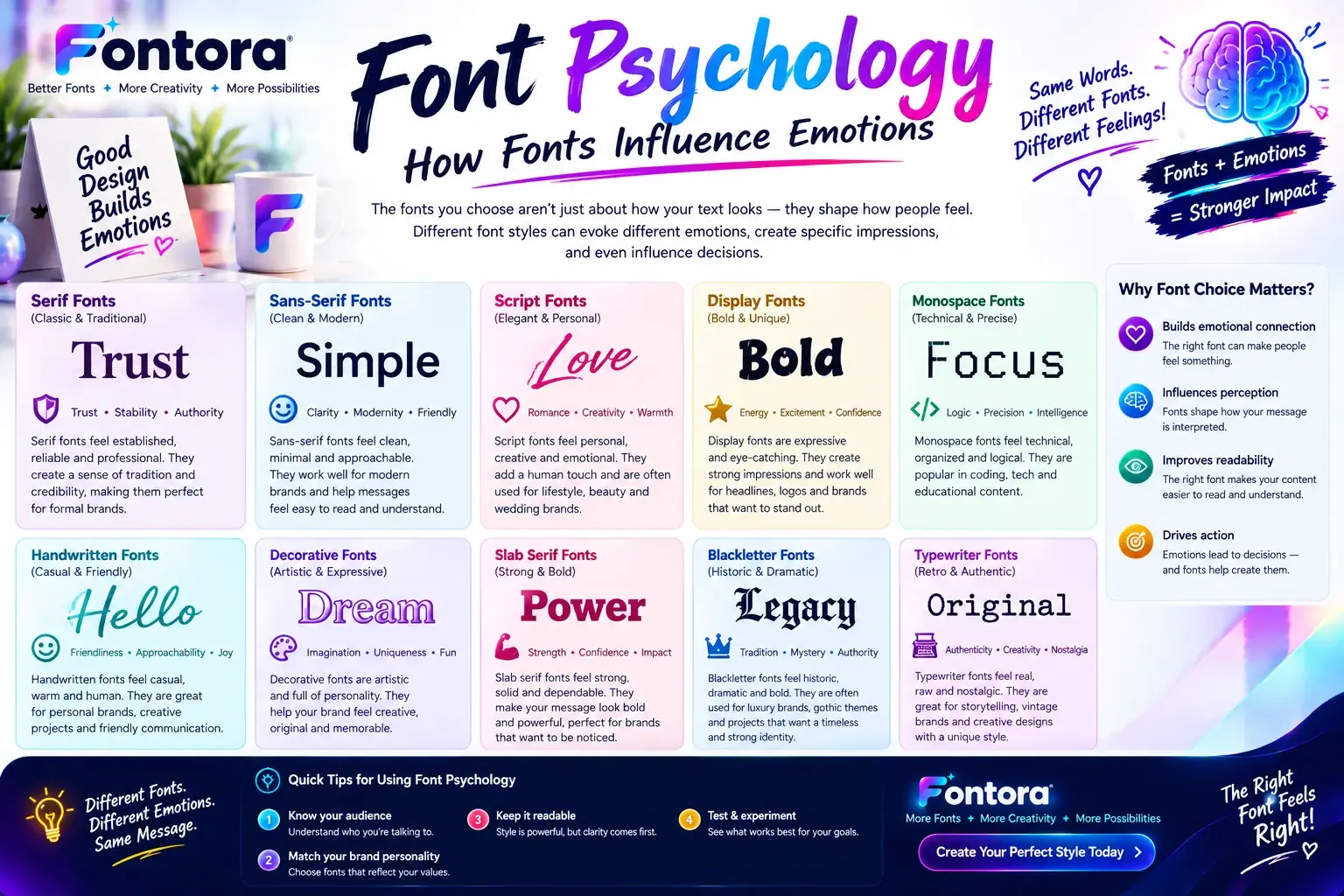
This connection between emotions and typography is known as font psychology. Different font categories create different impressions, which is why designers carefully select typefaces based on the feelings they want to communicate.
You can explore more about this relationship in our Font Psychology Guide.
Match Your Font Style With Your Brand Industry
Different industries often use specific typography styles because certain fonts naturally communicate particular qualities.
A professional service company, such as a law firm or financial organization, may choose fonts that create a sense of stability and trust. These brands often use classic typography styles because they want customers to feel confidence and reliability.
Creative industries such as fashion, photography, and entertainment usually have more freedom to experiment with expressive fonts. Unique typography can help these brands appear artistic and memorable.
Technology and software companies often choose simple, modern fonts because clean typography supports ideas like innovation, usability, and accessibility.
However, businesses should avoid selecting fonts only because they are popular. A font that works well for one company may not represent another brand effectively. The best choice is a font that aligns with your specific audience, values, and communication style.
Learn The Different Types Of Brand Fonts And Their Personality
Choosing the right font for a brand becomes easier when you understand how different typography styles communicate different emotions. Every font category has its own visual personality, and selecting the right style helps businesses create a stronger connection with their audience.
While thousands of typefaces exist, most brand fonts fall into a few main categories. Each category creates a different impression and works better for certain industries, audiences, and brand messages.
Serif Fonts: Traditional, Trustworthy, and Premium
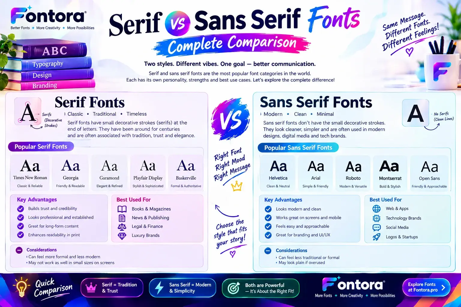
Serif fonts are typefaces that include small decorative strokes at the ends of letters. They have been used in books, newspapers, and professional publications for centuries, which gives them a feeling of experience and authority.
Brands often choose serif fonts when they want to appear:
Established
Elegant
Reliable
Sophisticated
Professional
Luxury brands, financial companies, legal businesses, and premium products frequently use serif typography because it creates a sense of trust and tradition.
For example, a high-end fashion brand may use a refined serif font to communicate craftsmanship and exclusivity, while a consulting company may use it to appear experienced and dependable.
However, serif fonts are not limited to traditional industries. Modern designers often combine classic serif styles with clean layouts to create a balance between heritage and contemporary design.
Sans Serif Fonts: Modern, Clean, and Simple
Sans serif fonts remove the decorative strokes found in serif typefaces. Their simple structure creates a clean and modern appearance, making them popular among digital-first brands.
These fonts often communicate:
Simplicity
Innovation
Accessibility
Modern thinking
Efficiency
Technology companies, startups, and online platforms frequently choose sans serif fonts because they work well on websites, mobile screens, and digital products.
A clean sans serif typeface can help users focus on the message rather than the design itself. This makes it a popular choice for brands that want to appear approachable and easy to understand.
When creating a digital brand, designers often consider how typography performs across different screens. A font that looks attractive in a logo should also remain readable on websites, apps, and social media platforms.
You can explore more typography concepts and font categories in our Font Styles Guide.
Script Fonts: Personal, Elegant, and Creative
Script fonts are inspired by handwritten lettering and often have flowing, connected characters. They create a more personal and artistic feeling compared to standard typefaces.
Brands may use script fonts when they want to communicate:
Creativity
Luxury
Personal connection
Beauty
Handmade quality
Common industries that use script typography include:
Beauty brands
Wedding businesses
Fashion companies
Lifestyle products
Creative services
Although script fonts can look beautiful, they should be used carefully. Highly decorative scripts may become difficult to read, especially in smaller sizes or digital environments.
Many brands use script fonts as accent elements rather than their main typography. For example, a business might use a script font in its logo while keeping a simpler font for website content.
Display Fonts: Unique, Bold, and Memorable
Display fonts are designed to attract attention. They usually have distinctive shapes, unusual details, or creative styles that help brands stand out.
These fonts are commonly used for:
Headlines
Campaign designs
Product packaging
Entertainment brands
Creative projects
Display fonts can make a strong visual impact, but they require balance. Using an overly complex display font everywhere can reduce readability and make the brand feel inconsistent.
A good approach is to use display typography for important areas, such as logos or promotional headlines, while using simpler fonts for longer text.
Choosing The Right Font Category For Your Brand
The best brand font is not always the most attractive font. It is the one that communicates the right message to the right audience.
A professional brand may benefit from a trustworthy serif style. A technology company may prefer a modern sans serif approach. A creative business may use expressive script or display typography.
Before making a final decision, consider:
Your brand personality
Your audience expectations
Your industry
Where the font will be used
How easily people can read it
A successful brand font should support your identity instead of distracting from it.
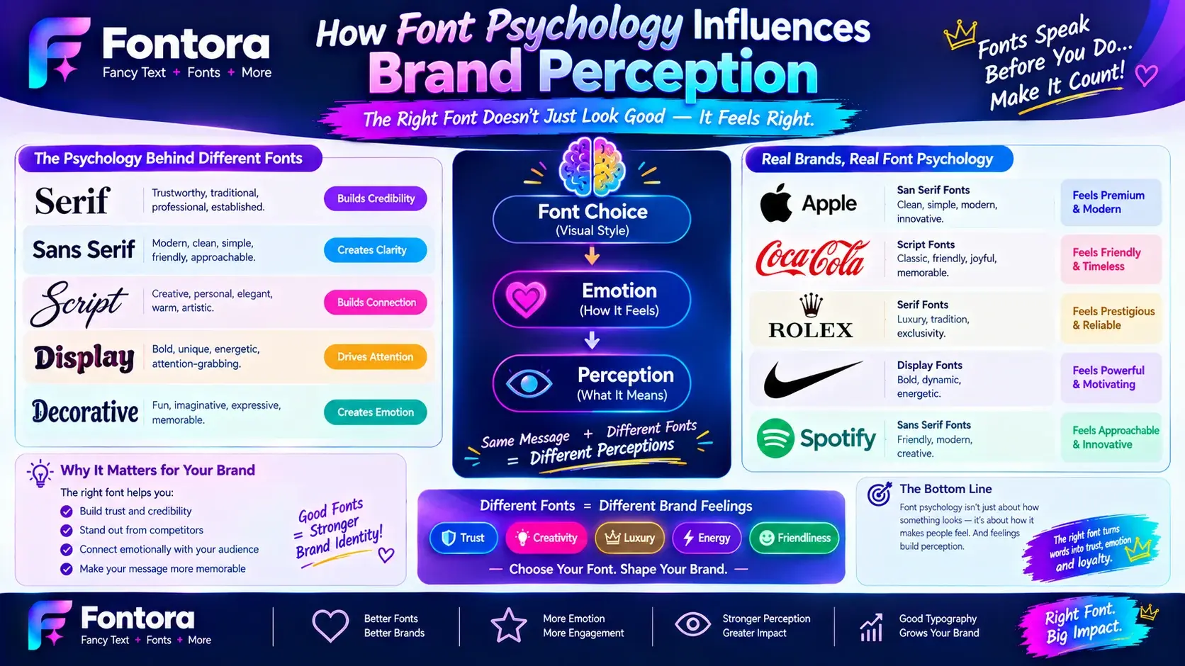
How Font Psychology Influences Brand Perception
Fonts communicate emotions before people fully understand the words they display. The shape, spacing, weight, and style of a typeface can influence how an audience feels about a brand and what qualities they associate with it.
This connection between typography and human perception is known as font psychology. Designers use this concept to select typefaces that support a brand’s personality and create the right emotional response.
For example, a bold and heavy font may communicate strength and confidence, while a thin and elegant font may suggest luxury and sophistication. A rounded typeface may feel friendly and approachable, while a structured geometric font may appear modern and professional.
Understanding these emotional associations helps businesses choose fonts that match their goals instead of selecting a typeface only because it looks attractive.
How Different Font Characteristics Affect Brand Feel
Every part of a font contributes to its overall impression. Small details such as thickness, shape, and spacing can change how people perceive a brand.
Font Weight
Font weight refers to how thick or thin the letters appear.
Bold fonts often create feelings of:
Strength
Confidence
Energy
Authority
They are commonly used by brands that want to appear powerful and noticeable.
Light fonts usually create a feeling of:
Elegance
Minimalism
Sophistication
Modern design
They are often used by premium or lifestyle brands.
Font Shape
The shape of letters can also influence brand perception.
Rounded fonts often feel:
Friendly
Playful
Approachable
They are suitable for brands targeting younger audiences or businesses that want a casual personality.
Sharp and geometric fonts often communicate:
Precision
Innovation
Professionalism
These styles are commonly seen in technology, architecture, and modern business branding.
Font Spacing
Letter spacing affects how a brand feels visually.
Wide spacing can create:
Luxury
Openness
Calmness
Tight spacing can create:
Energy
Compactness
Boldness
Luxury brands often use generous spacing because it creates a premium and balanced appearance.
Match Font Emotions With Your Target Audience
A successful brand font should not only represent the company; it should also connect with the people who interact with it.
A children's education brand may choose playful typography because it creates a sense of fun and creativity. A financial organisation may choose a more professional typeface because customers expect trust and security.
Before choosing a font, think about the audience you want to attract:
What emotions should customers feel?
What qualities should they associate with your brand?
Does the typography match their expectations?
The right font creates alignment between the brand message and customer perception.
Avoid Choosing Fonts Based Only On Trends
Design trends change frequently, but brand identity needs long-term consistency. A font that looks popular today may not represent your business in the future.
Many businesses make the mistake of selecting a font because it looks visually impressive without considering readability, audience, or brand personality.
A better approach is to choose typography that supports your long-term identity. The font should work across your website, logo, marketing materials, social media graphics, and other brand assets.
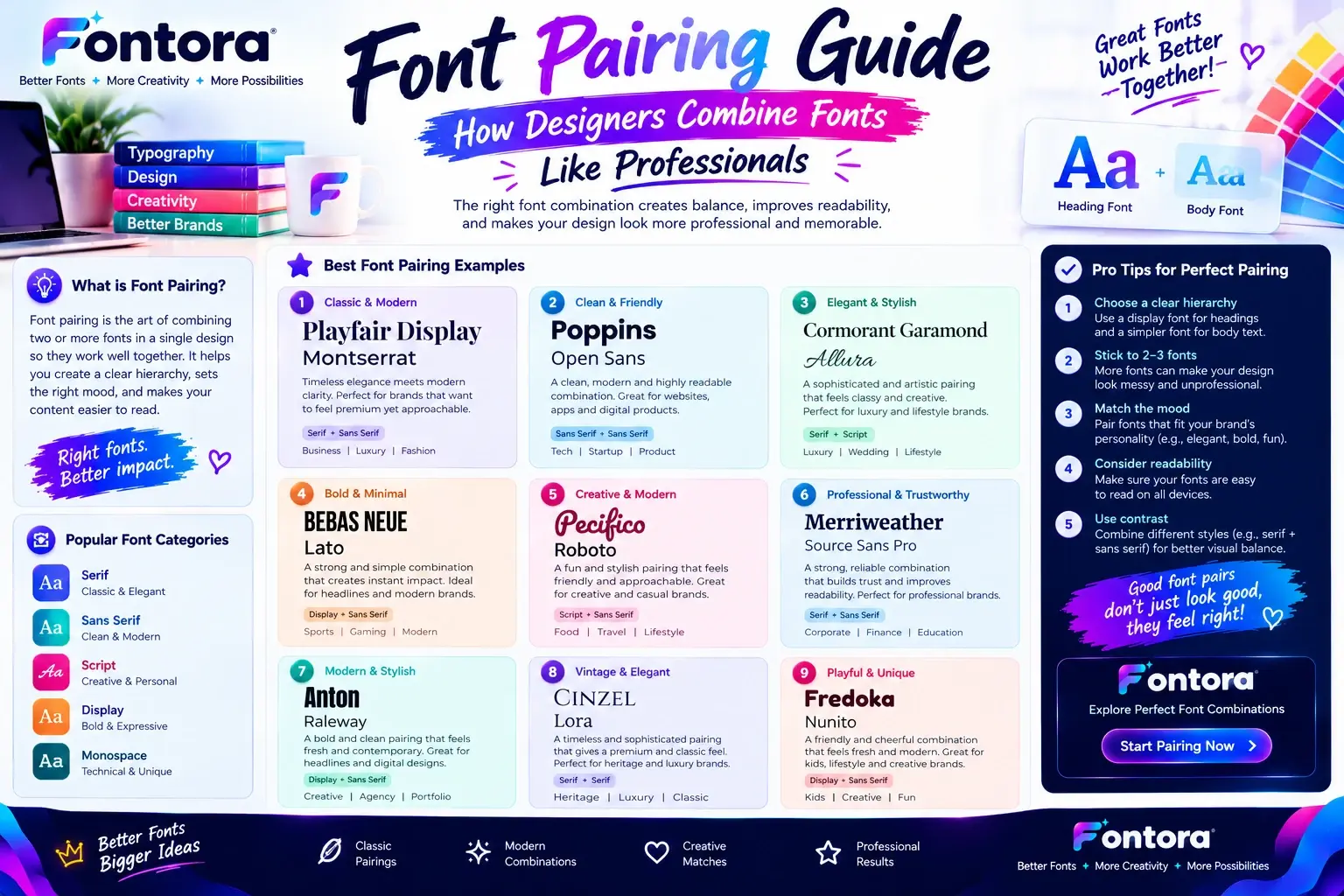
For brands that want to understand how different typefaces work together, our Font Pairing Guide explains how designers combine fonts effectively.
Build Emotional Connection Through Typography
The strongest brands use fonts as part of their storytelling. Typography helps communicate who they are before customers read a single sentence.
A carefully selected font can make a brand appear:
More trustworthy
More memorable
More professional
More recognisable
When typography matches the values of a business, it becomes a powerful visual asset rather than just a design choice.
The goal is not to find the most beautiful font available. The goal is to find the font that best represents your brand and creates the right experience for your audience.
How To Choose The Right Font For Your Brand: A Step-by-Step Process
Choosing a brand font requires more than selecting a typeface that looks attractive. A successful font choice should represent your business personality, communicate the right message, and create a consistent experience across every place where customers see your brand.
Whether you are designing a logo, building a website, creating social media graphics, or preparing marketing materials, the font you choose becomes part of your brand identity. Following a structured process helps you avoid common mistakes and select typography that supports your long-term goals.
Step 1: Define Your Brand Personality
The first step in choosing the right font is understanding what your brand represents. Before exploring different typefaces, clearly define the emotions and characteristics you want your audience to associate with your business.
Start by describing your brand using a few key words.
For example:
A luxury brand may want to appear:
Elegant
Exclusive
Sophisticated
Premium
A technology brand may want to communicate:
Innovative
Modern
Simple
Efficient
A creative brand may focus on:
Artistic
Unique
Expressive
Inspiring
These qualities help guide your font selection. A font that matches your brand personality will feel natural to your audience, while a mismatched font can create confusion.
For example, using a playful handwritten font for a serious financial company may send the wrong message. Similarly, a strict corporate font may not represent a fun lifestyle brand effectively.
Step 2: Understand Your Target Audience
Your brand font should connect with the people you want to reach. Different audiences respond to different visual styles, so understanding customer expectations is an important part of typography selection.
Consider:
Age group
Industry preferences
Customer needs
Cultural expectations
Buying behavior
For example, a brand targeting young creative professionals may prefer modern and flexible typography, while a business serving corporate clients may need a more established and professional appearance.
The right font creates familiarity. When customers see typography that matches their expectations, the brand feels more trustworthy and easier to understand.
Step 3: Select A Font Category That Matches Your Message
After defining your brand personality and audience, choose a font category that supports your message.
Serif fonts often work well for brands that want to communicate experience, tradition, and reliability.
Sans serif fonts are popular for businesses that want a clean, modern, and accessible appearance.
Script fonts can add personality and creativity when used correctly.
Display fonts can create strong visual impact for brands that want a memorable and distinctive identity.
The goal is not to choose a font because it is popular. The goal is to choose a style that strengthens your brand communication.
You can explore different typography categories through our Typography Guide to better understand how fonts influence visual identity.
Step 4: Check Font Readability Across Different Platforms
A font may look impressive in a design preview but fail in real-world use. Brands need typography that works consistently across different environments.
Your font should remain clear on:
Websites
Mobile screens
Social media posts
Packaging
Advertisements
Presentations
For example, a highly decorative font may look excellent in a logo but become difficult to read when used for website paragraphs.
Professional brands usually create a typography system where each font has a specific role:
Logo font for brand recognition
Heading font for attention
Body font for readability
This approach creates consistency while keeping the design functional.
Step 5: Test Different Font Options Before Finalising
Before choosing a final brand font, test how it appears in real situations.
Create examples such as:
Logo mockups
Website headings
Social media posts
Business cards
Marketing designs
Testing helps identify whether the font feels natural and whether it represents the brand correctly.
Ask yourself:
Does this font match my brand personality?
Is it easy to read?
Does it look professional?
Will it still work after several years?
Does it stand out from competitors?
A font decision should be based on strategy, not only personal preference.
Step 6: Check Font Licensing And Usage Rights
Font licensing is an important consideration, especially for businesses.
Some fonts are free for personal projects but require a commercial license for business use. Using a font without proper permission can create legal issues later.
Before using a font for branding, check:
Commercial usage rights
Website usage permissions
Logo usage rules
Distribution restrictions
A reliable font choice should not only look good but also be safe for long-term business use.
Step 7: Create Consistency Across Your Brand
A strong brand does not use random fonts in different places. Consistency helps customers recognise your business more easily.
Your chosen typography should work together across:
Logo design
Website pages
Social media content
Email marketing
Product materials
Many brands create a simple font system with one main typeface and supporting fonts. This creates a professional appearance while maintaining flexibility.
A consistent typography style makes every customer interaction feel connected to the same brand.
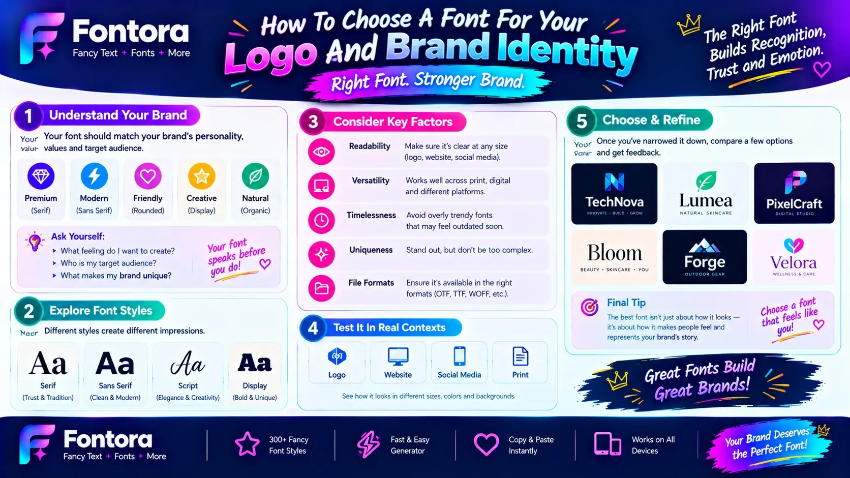
How To Choose A Font For Your Logo And Brand Identity
A logo is often the first visual element people associate with a business, and the font used in that logo plays an important role in creating recognition. The right logo font should represent the brand personality, remain memorable, and communicate the right message to the audience.
Many businesses focus heavily on symbols, colors, and layouts but underestimate the impact of typography. A carefully selected font can make a simple logo feel premium, modern, creative, or trustworthy.
When choosing a font for a logo, the goal is not to select the most decorative option. The best logo fonts are those that balance uniqueness, readability, and brand relevance.
Choose A Logo Font That Represents Your Brand Message
Your logo font should immediately reflect what your business stands for.
For example, a luxury fashion company may choose an elegant serif or refined script font because these styles often communicate sophistication and exclusivity.
A technology company may prefer a clean sans serif font because it creates a feeling of innovation, simplicity, and reliability.
A children's brand may use friendly rounded fonts because they create a sense of creativity and approachability.
Before selecting a logo font, consider the main message your brand wants to communicate:
Trust and professionalism
Creativity and imagination
Luxury and exclusivity
Innovation and modern thinking
Friendliness and accessibility
The font should support your message instead of distracting from it.
Prioritise Simplicity And Recognition
A successful logo needs to be recognisable quickly. Overly complicated fonts may look interesting at first but can become difficult to remember or identify.
The best logo fonts usually have:
Clear letter shapes
Balanced spacing
Strong readability
A distinctive appearance
Think about how the logo will appear in different sizes. A font that looks good on a large screen should also remain clear on a mobile app icon, business card, or small advertisement.
Simple does not mean boring. Many successful brands use minimal typography because clean designs are easier for customers to remember.
Consider Where Your Logo Will Be Used
Modern brands appear across many platforms, so a logo font needs to perform well in different environments.
Your logo may appear on:
Websites
Mobile applications
Social media profiles
Packaging
Advertisements
Printed materials
A highly detailed font may work for a large poster but lose clarity when displayed as a small social media profile image.
Before finalising a logo font, test it in different formats to make sure it maintains its visual impact everywhere.
Avoid Using Too Many Font Styles In One Logo
One common branding mistake is combining too many font styles together.
Using multiple decorative fonts can make a logo feel confusing and reduce professionalism.
Most effective logos use:
One primary font
Sometimes one supporting font
Balanced spacing and alignment
A strong logo does not need many visual elements to stand out. The right font choice, combined with good design principles, can create a memorable identity.
Match Your Logo Font With Your Overall Brand Typography
Your logo should not feel disconnected from the rest of your brand design.
The font used in your logo should work well with:
Website headings
Marketing materials
Social media graphics
Product designs
For example, if your logo uses a modern minimalist font, your website typography should support a similar feeling. This creates a consistent brand experience.
A complete typography system helps customers recognize your business across different channels. You can also explore different font styles and combinations through our Font Pairing Guide.
Test Your Font Against Competitors
Before selecting a final logo font, compare it with businesses in your industry.
The purpose is not to copy competitors but to understand the visual patterns customers already recognise.
Ask:
Does my font look too similar to other brands?
Does it communicate something unique?
Will customers remember it?
Does it represent my positioning?
A strong logo font should fit your industry while still helping your brand create a unique identity.
Use Professional Font Tools For Better Results
Finding the right logo font can take time because there are thousands of typography options available. Font tools can help designers and business owners explore different styles, test combinations, and discover suitable options.
A font generator can be useful during the brainstorming stage because it allows you to experiment with different typography directions before making a final decision.
For more font creation ideas, explore the Font Generator tool to discover different typography possibilities for your projects.
How To Combine Fonts For A Professional Brand Design
Choosing one font is only part of creating a strong brand identity. Many businesses use more than one typeface to create visual balance between different elements, such as logos, headlines, website content, and marketing materials.
This process is known as font pairing. It involves combining different fonts that work together while maintaining a consistent brand personality.
A good font combination creates hierarchy, improves readability, and helps guide the audience through your content. A poor combination can make a design feel confusing, inconsistent, or unprofessional.
Why Font Pairing Matters For Branding
A brand usually communicates through different types of content. A website may need large headings, readable paragraphs, buttons, product descriptions, and promotional graphics.
Using the same font everywhere can sometimes limit the visual structure of a design. Combining fonts allows each element to have a clear purpose.
For example:
A bold heading font can attract attention
A simple body font can improve readability
An accent font can add personality
The goal is not to use many fonts. The goal is to create a balanced typography system where every font has a specific role.
Most professional brands use a limited number of typefaces because consistency is more important than variety.
Follow The Two To Three Font Rule
One of the most common typography guidelines is keeping your brand font system simple.
Many designers recommend using:
One primary font
One secondary font
Optional accent font
The primary font is usually used for important brand elements such as logos and headings.
The secondary font supports readability in areas like website paragraphs and long-form content.
An accent font can be used occasionally for special design elements, but it should not overpower the main typography.
Using too many fonts can weaken brand recognition because every design element starts communicating a different message.
Create Contrast Between Your Fonts
Good font combinations usually have contrast. If two fonts look almost identical, the design may feel unbalanced because they compete for the same role.
Contrast can come from differences in:
Font category
Weight
Size
Spacing
Style
For example, a modern sans serif heading paired with a classic serif body font can create an interesting balance between simplicity and professionalism.
Similarly, a clean font combined with a subtle script accent can add creativity without affecting readability.
The key is finding fonts that are different enough to create hierarchy but similar enough to feel connected.
Match Fonts With Your Brand Personality
Font combinations should always support your brand identity.
A luxury brand may combine an elegant serif heading with a clean minimalist body font to create a premium experience.
A technology brand may use two modern sans serif fonts to maintain a simple and innovative appearance.
A creative business may combine a unique display font with a readable supporting typeface.
Before combining fonts, ask:
Do these fonts represent my brand?
Do they create the right emotion?
Are they suitable for my audience?
Do they work across different platforms?
The best combinations feel intentional rather than random.
Test Font Combinations In Real Brand Examples
A font pairing may look attractive in a design tool but perform differently in real situations.
Test your combinations on:
Website pages
Logo designs
Social media posts
Presentations
Marketing materials
Pay attention to readability and overall balance.
A heading font might look impressive but become difficult to understand when used in longer text. A body font might be readable but lack personality for important brand elements.
Testing helps you create a typography system that works in practical situations.
Use Typography Tools To Explore Different Combinations
Finding the right font combination can require experimentation. Typography tools help designers and businesses compare different styles and discover combinations that match their brand direction.
Exploring different typefaces before making a final decision saves time and helps create a more consistent visual identity.
For more information about choosing and combining typefaces, explore our Typography Guide.
Common Font Pairing Mistakes To Avoid
Many branding problems happen because fonts are selected without considering the complete design system.
Common mistakes include:
Choosing Fonts That Are Too Similar
Fonts with almost identical appearances can create a lack of hierarchy. Readers may not understand which elements are more important.
Combining Too Many Styles
Using multiple decorative fonts can make a brand appear inconsistent and reduce professionalism.
Ignoring Readability
A beautiful font is not useful if customers cannot easily read the message.
Following Trends Without Considering Brand Identity
Popular fonts change over time, but a brand needs typography that supports long-term recognition.
A successful font pairing creates harmony between creativity and usability. The right combination helps a brand communicate clearly while building a memorable visual experience.
Famous Brand Typography Examples And What We Can Learn From Them
Successful brands understand that typography is not just decoration. The fonts they choose become part of their identity and help customers recognize them across different platforms.
A strong brand font creates consistency between a company’s logo, website, advertising, packaging, and digital presence. While colors and symbols are important, typography often communicates the personality of a brand before customers interact with its products or services.
Studying how established brands use fonts can provide valuable insights when choosing your own brand typography.
Apple: Minimal, Clean, and Modern Typography
Apple is widely recognised for its minimalist design approach. The company’s typography choices support its message of simplicity, innovation, and premium technology.
Apple’s visual identity focuses on:
Clean layouts
Simple typography
Strong readability
Modern appearance
The brand avoids unnecessary visual complexity and uses typography that allows products and messages to remain the main focus.
The lesson for businesses is that a font does not need to be complicated to create a strong impression. A simple and well-balanced typeface can communicate confidence and professionalism.
For technology brands, clean typography often works effectively because it supports ideas such as usability, innovation, and efficiency.
Google: Friendly and Accessible Typography
Google’s typography reflects its goal of creating simple and accessible digital experiences. The brand uses a clean, modern approach that feels approachable to users around the world.
Google’s typography communicates:
Friendliness
Simplicity
Creativity
Accessibility
The company’s design system shows how typography can make a technology brand feel more human.
The lesson is that fonts should match how a brand wants customers to feel. A business that wants to appear approachable may choose typography with softer shapes and a more welcoming appearance.
Nike: Bold and Confident Typography
Nike’s branding is built around energy, movement, and performance. Its typography choices support a strong and confident identity.
The brand uses bold visual communication that reflects:
Strength
Action
Motivation
Confidence
For sports, fitness, and lifestyle brands, strong typography can help communicate energy and create emotional connections with customers.
The lesson is that font choices should reinforce the feeling behind your brand message. A powerful brand needs typography that feels equally powerful.
Coca-Cola: Traditional and Recognisable Typography
Coca-Cola is an example of how a distinctive typography style can become a memorable part of brand recognition.
The company’s script-style lettering creates associations with:
Heritage
Tradition
Familiarity
Emotional connection
The lesson from Coca-Cola is that unique typography can help a brand stand apart when it is used consistently over time.
However, businesses should remember that decorative fonts work best when they support the brand message and remain recognisable.
Luxury Brands: Elegant Typography For Premium Positioning
Many luxury brands use refined typography to communicate exclusivity and craftsmanship.
Common characteristics include:
Elegant serif fonts
Balanced spacing
Minimal design
Sophisticated layouts
These choices create a premium feeling because the typography itself becomes part of the customer experience.
For businesses targeting luxury audiences, font selection should focus on creating an impression of quality and attention to detail.
What These Brands Teach Us About Choosing Fonts
Although every successful brand has a different visual identity, they follow similar principles:
Consistency Matters
Strong brands use typography consistently across different platforms. Customers recognize brands faster when the same visual language appears everywhere.
Fonts Should Match Brand Personality
A font should represent what the business stands for. Modern brands, luxury brands, creative brands, and professional services all require different typography approaches.
Readability Is Essential
Even famous brands prioritise clarity. A font should communicate the message effectively instead of creating unnecessary complexity.
Simple Designs Can Be Powerful
Many successful brands prove that effective typography does not require excessive decoration. The right font with the right strategy creates a stronger impact.
When selecting brand fonts, businesses should study successful examples but avoid copying them. The goal is to understand the principles behind effective typography and apply them to create a unique brand identity.
Common Mistakes To Avoid When Choosing A Brand Font
Choosing a font for your brand is an important design decision, but many businesses make mistakes that reduce the effectiveness of their visual identity. A font may look attractive on its own, but it must also support your brand message, audience expectations, and long-term goals.
A successful brand font should balance creativity, readability, consistency, and functionality. Avoiding common typography mistakes helps businesses create a stronger and more professional appearance.
Choosing A Font Only Because It Looks Attractive
One of the most common mistakes is selecting a font based only on personal preference.
A font that looks beautiful to a business owner may not communicate the right message to customers. Every typeface creates a certain impression, and that impression should match the brand identity.
For example, an elegant script font may look attractive, but it may not be suitable for a technology company that wants to communicate simplicity and innovation.
Before choosing a font, consider:
Does it represent my brand personality?
Does it connect with my target audience?
Does it support my industry?
Does it work in different situations?
The best font is not always the most visually impressive one. It is the font that helps communicate the brand message effectively.
Using Too Many Fonts In Brand Design
Another common mistake is using too many typefaces across different brand materials.
Some businesses use a different font for their logo, website, social media posts, advertisements, and presentations. This creates inconsistency and makes the brand feel disconnected.
A professional typography system usually uses a limited number of fonts with clear purposes.
For example:
One font for the logo and main identity
One font for headings
One font for body content
This approach creates a cleaner visual experience and helps customers recognize the brand more easily.
Consistency is one of the most important principles of branding because repeated visual elements build familiarity over time.
Ignoring Readability
A visually unique font is not useful if people cannot easily read it.
Some decorative fonts may look impressive in a logo or design preview but become difficult to understand when used on websites, mobile screens, or marketing materials.
Readability is especially important for:
Website content
Product descriptions
Advertisements
Email marketing
Digital applications
A good brand font should look attractive while still allowing customers to quickly understand the message.
The purpose of typography is communication first and decoration second.
Following Trends Instead Of Building Identity
Design trends change constantly. A font style that is popular today may feel outdated after a few years.
Businesses sometimes choose trendy fonts because they want a modern appearance, but this can create problems if the style does not match their long-term identity.
A strong brand font should remain effective for years. Instead of following every design trend, focus on selecting typography that represents your values and connects with your audience.
Timeless design choices usually create stronger brand recognition than temporary visual trends.
Ignoring Font Licensing
Font licensing is an important factor that many businesses overlook.
Not every font available online can be used commercially. Some fonts are free for personal projects but require permission or payment for business usage.
Before using a font for branding, check:
Commercial usage rights
Logo permissions
Website licensing
Marketing usage rules
Choosing a legally usable font protects your brand from future problems and ensures that your typography can be used confidently across different platforms.
Not Testing Fonts In Real Situations
A font should never be selected only from a preview page.
A typeface may look excellent in a font library but perform differently when applied to real brand materials.
Before finalising a font, test it on:
Website designs
Logo concepts
Social media graphics
Product packaging
Advertisements
Testing helps you understand whether the font maintains its quality across different sizes and formats.
A professional brand font should look consistent everywhere customers interact with your business.
Copying Competitor Typography
Competitor research is useful, but directly copying another brand’s typography can weaken your identity.
Successful brands study competitors to understand industry patterns, but they create their own visual direction.
Instead of asking:
"What font does my competitor use?"
Ask:
"What feeling do I want my customers to experience?"
A unique typography approach helps your brand become more memorable and differentiated.
Avoiding these mistakes makes the font selection process more strategic. The right brand font should not only look good but also communicate your values, support customer experience, and strengthen recognition.
Best Tools And Resources To Find The Right Brand Font
Finding the right font for your brand can be challenging because thousands of typefaces are available online. The best choice depends on your brand personality, industry, audience, and where the font will be used.
Font tools make this process easier by allowing businesses, designers, and creators to explore different typography styles, compare options, and discover fonts that match their visual direction.
A good font discovery process should not be based only on finding a beautiful typeface. It should focus on finding a font that supports your brand identity and creates a consistent experience.
Font Generators For Exploring Typography Ideas
Font generators are useful during the early stages of branding because they allow you to experiment with different text styles quickly.
They help you explore:
Different font appearances
Typography combinations
Creative design directions
Logo ideas
Brand style concepts
For example, a business owner creating a new brand can test different typography styles before choosing a final direction.
Tools like a Font Generator can help users discover creative possibilities and understand how different styles may look with their brand name or project.
Font Libraries For Discovering Professional Typefaces
Font libraries provide access to thousands of typefaces created by professional designers. They allow users to explore different categories such as:
Serif fonts
Sans serif fonts
Script fonts
Display fonts
Modern typography styles
When browsing font libraries, focus on more than appearance. Check:
Readability
Available font weights
Language support
Licensing terms
Professional usage options
A font that looks impressive but lacks important variations may become difficult to use across a complete brand system.
Typography Guides For Better Font Decisions
Learning typography principles helps businesses make better font choices.
Understanding concepts like:
Font hierarchy
Letter spacing
Font pairing
Visual balance
Brand consistency
allows you to select fonts strategically instead of choosing randomly.
Typography is not only about selecting letters; it is about creating a visual communication system that supports your brand message.
You can learn more about typography fundamentals through our Typography Guide.
Design Platforms For Testing Brand Fonts
Design platforms allow you to see how fonts perform in real projects.
You can test typography on:
Logo designs
Social media templates
Website layouts
Presentations
Marketing materials
Testing fonts in realistic situations helps you understand whether they match your brand goals.
A font that looks good in isolation may not always work well when combined with colors, images, and other design elements.
Create A Font Selection Process Before Finalizing
Instead of choosing the first font you like, create a simple evaluation process.
Ask these questions:
Does The Font Match My Brand Personality?
The font should communicate the same qualities as your business.
Is It Easy To Read?
Customers should understand your message quickly.
Does It Work Everywhere?
The font should perform well on websites, mobile devices, printed materials, and social platforms.
Can My Brand Grow With This Font?
A good font should remain useful as your business expands.
Use Inspiration But Create A Unique Identity
Looking at successful brands can provide inspiration, but your final typography choice should represent your own business.
Study how brands use:
Font style
Spacing
Size
Layout
Typography combinations
Then adapt these principles to your own identity.
The goal is not to find the same font as another company. The goal is to create a typography system that customers can associate with your brand.
Choosing the right brand font becomes easier when you combine creativity with strategy. Font tools, typography resources, and testing methods help businesses make informed decisions and build a stronger visual identity.
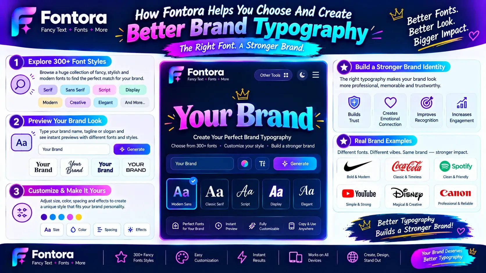
How Fontora Helps You Choose And Create Better Brand Typography
Choosing the right font for a brand can feel overwhelming because there are countless typography options available. Businesses need a simple way to explore different styles, test ideas, and discover fonts that match their identity.
Fontora helps creators, designers, and businesses experiment with typography and find creative directions for their branding projects. Instead of spending hours searching through random font options, users can explore different text styles and understand how their brand name may appear with different visual approaches.
Whether you are creating a new business identity, refreshing an existing brand, or designing marketing materials, exploring typography options early can help you make better design decisions.
Discover Different Typography Styles
Every brand has a different personality, and the right font style depends on the message you want to communicate.
With Fontora, users can explore different typography directions, including:
Modern and clean styles
Elegant and premium styles
Creative and artistic styles
Bold and expressive styles
Experimenting with different styles allows you to compare how your brand name feels in different visual formats.
A technology startup may prefer a simple and modern appearance, while a creative business may want something more distinctive. Testing different options helps you understand which direction feels most aligned with your brand.
Create Ideas Before Final Design Decisions
Font selection is an important early step in the branding process. Before investing time into complete designs, businesses can explore different typography concepts and identify styles that match their goals.
For example, you can test:
Business names
Logo concepts
Website headings
Social media designs
Marketing ideas
This creative process helps remove uncertainty and gives designers a clearer direction before creating final brand assets.
Build A Consistent Visual Identity
A successful brand uses typography consistently across every customer interaction.
The font style chosen for your brand should work with:
Website design
Social media content
Digital advertisements
Presentations
Promotional materials
Consistency helps customers recognise your brand and creates a more professional appearance.
Fontora can be part of the exploration process by helping users discover typography styles that support a unified visual identity.
Typography Is More Than Choosing A Font
A successful brand font is not simply the one that looks attractive. It should communicate the right emotions, support readability, and create a connection with your audience.
The best typography choices consider:
Brand personality
Customer expectations
Industry requirements
Digital usability
Long-term consistency
By understanding these factors, businesses can move beyond random font selection and create a stronger visual presence.
Start Exploring Your Brand Font Ideas With Fontora
Finding the right typography takes creativity, testing, and a clear understanding of your brand goals. Fontora provides an easy way to explore different font possibilities and discover styles that fit your creative vision.
Whether you are building a new brand, designing content, or improving your online presence, the right typography can help your message stand out.
Start experimenting with different font ideas using the Font Generator and discover new possibilities for your brand identity.
Conclusion
Choosing the right font for your brand is an important step in building a strong and recognisable identity. A successful brand font does more than make a design look attractive; it communicates your values, creates the right emotional connection, and helps customers remember your business.
The best typography choice comes from understanding your brand personality, audience, industry, and long-term goals. Whether you choose a trusted serif style, a modern sans serif, an elegant script, or a creative display font, the focus should always be on consistency, readability, and meaningful communication.
By using the right brand fonts across your logo, website, social media, and marketing materials, you can create a professional and unified visual experience. Take time to explore different typography styles, test your options, and choose a font that truly represents your brand message.
With tools like Fontora, exploring typography ideas becomes easier, helping you discover creative font directions and build a stronger brand identity.
Frequently Asked Questions About Choosing The Right Font For Your Brand
1. How do I choose the right font for my brand?
Choose the right font for your brand by understanding your brand personality, target audience, industry, and the emotions you want to communicate. A good brand font should match your identity, remain readable across platforms, and create consistency between your logo, website, marketing materials, and digital content.
2. What is the best font style for branding?
The best font style for branding depends on your business goals and audience. Serif fonts often communicate trust and luxury, sans serif fonts create a modern and clean feeling, script fonts add elegance and creativity, and display fonts help brands create a bold and memorable identity.
3. How many fonts should a brand use?
Most brands should use two or three fonts to maintain a professional and consistent visual identity. A primary font can represent the main brand style, while secondary fonts can support headings, body content, and creative elements without making the design feel inconsistent.
4. How do fonts affect brand identity?
Fonts influence how customers perceive a brand by communicating emotions, personality, and values. Typography can make a business appear professional, modern, friendly, luxurious, or creative. The right font helps create recognition and builds a stronger connection between a brand and its audience.
5. Should a brand use the same font for its logo and website?
A brand does not always need to use the exact same font for its logo and website. Many businesses use a unique logo font combined with supporting website typography. The important factor is maintaining a consistent visual style that represents the brand personality.
6. What makes a good brand font?
A good brand font should be readable, memorable, versatile, and aligned with the company’s personality. It should work well across different platforms, including websites, social media, advertisements, packaging, and printed materials while maintaining a professional appearance.
7. How do I choose a font for my logo?
Choose a logo font that represents your brand message and remains recognizable at different sizes. Focus on simplicity, readability, uniqueness, and consistency. A good logo font should look professional on websites, business cards, social media profiles, and other brand materials.
8. What is font psychology in branding?
Font psychology explains how different typefaces influence emotions and perceptions. For example, serif fonts can create feelings of trust and tradition, while modern sans serif fonts often communicate simplicity and innovation. Brands use font psychology to select typography that matches their desired image.
9. Can I use free fonts for my brand?
Yes, you can use free fonts for branding, but you should always check the font license before commercial use. Some fonts are free for personal projects but require permission or payment for business applications such as logos, websites, and marketing campaigns.
10. Where can I find fonts for my brand design?
You can find brand fonts through font libraries, typography tools, and font generators. These resources help you explore different styles, compare options, and discover typography that matches your brand identity. Tools like Fontora can help you experiment with different font ideas before selecting a final design direction.